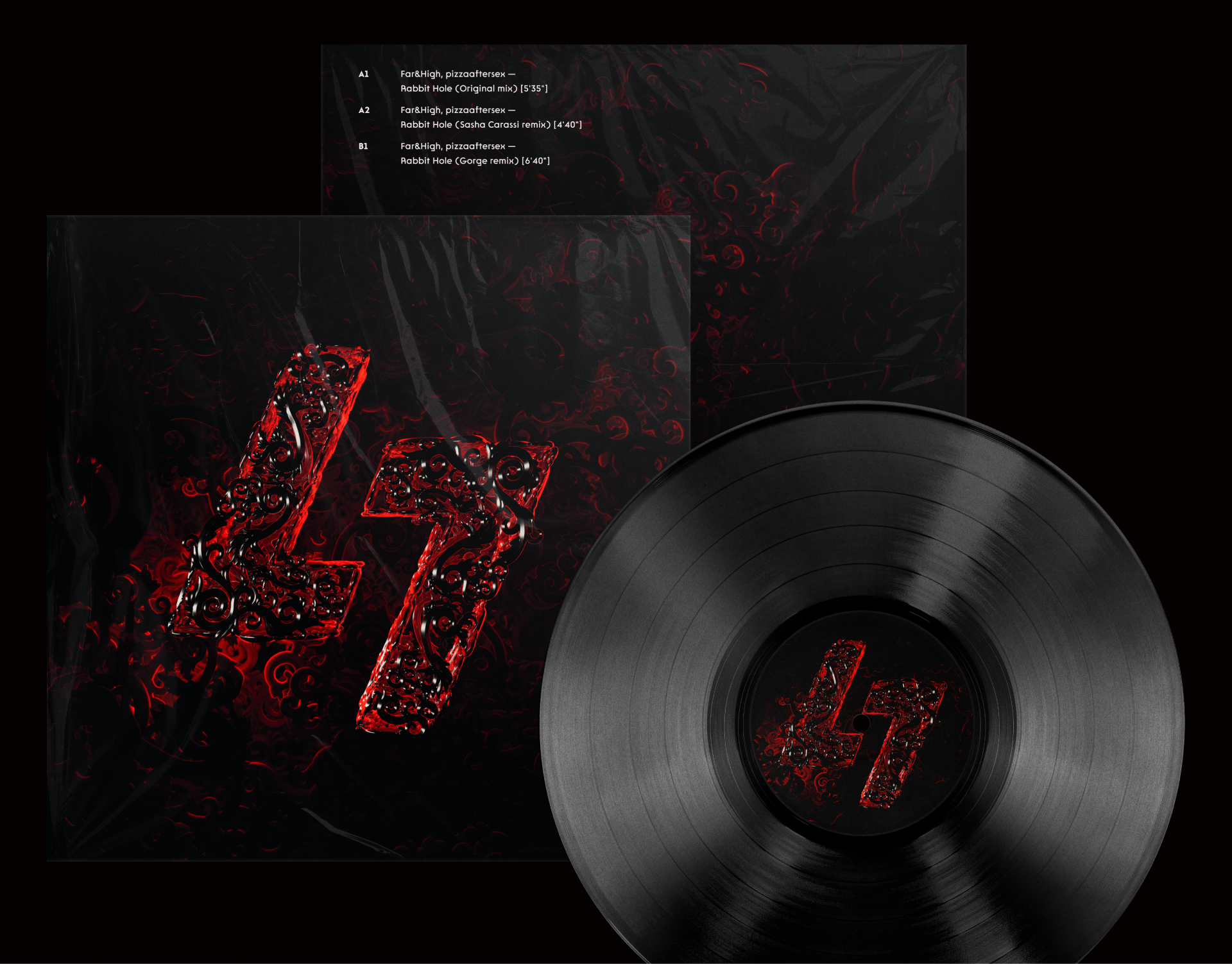
UNHEARD-MUSIC_KEY-VISUAL
BRAND IDENTITY
A vinyl record as the medium for a brand that releases music without a label, without charts, and without algorithms. A complete visual system built for the first release.
Unheard Music is an independent platform for artists who release music on their own, without label backing. Before launch, the brand had nothing: no logo, no voice, no consistent visual language — just a name and a stack of tracks waiting to go out into the world.
The brief was simple to say and harder to do: build a brand that looks as independent as the music it represents sounds. The real challenge was turning an abstract idea like "independence" into something tangible — a color, a shape, a material.
Music brands almost always visualize sound through abstraction — waves, particles, gradients. It fades from memory fast. What was needed was an image that physically belongs to music, not one that illustrates it metaphorically.
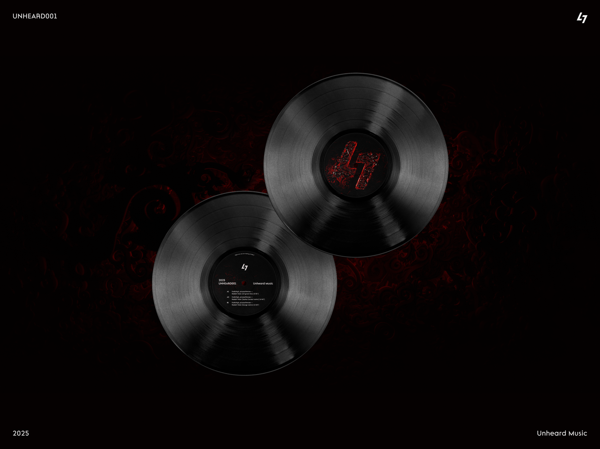
We took the format itself — vinyl — and made it the lead character of the identity. The record's grooves became a graphic pattern, and the label at its center became a space for a mark that shifts from release to release.
We gathered references from 70s vinyl culture — sleeve art, label typography, paper textures. The common thread: rough print, hard contrast, minimal color.
We tested six versions of the monogram. We landed on one that reads as both the letter U and a stylized record groove — a double reading that makes it stick.
We built a groove-based graphic pattern with realistic light behavior across the surface — this became the foundation for every future asset, not a one-off effect for a single case.
We documented the rules: the cover grid, an accent-color system by genre, and the core layout principles that keep every release on-brand without needing us in the room.
The palette is built around vinyl black and a single hot accent — a signal orange that marks the live, active elements across covers and the interface. The display type is wide and dense, like text pressed into the edge of a record; the body type is a neutral grotesk that stays out of the image's way.
 VINYL COVER
 PATTERN
 GUIDELINES